Omphaloskepsis Blog
Inspiring web page designs for and by artists.
Jul 1, 2011
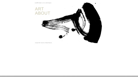
Lynn Schirmer gets my kudos award for best website.
Four things you need to be acutely aware of when designing a website:
visual design,
information design,
navigation design,
back end design.

This site nailed it. There’s no big files or piggish flash loading making you wait. WYSIWYG! There is no splash page before you get the goods. No chance you get to the name and leave and not see the work. Conceptually, all the colors and design elements carry it through. The information is relevant. 
Here’s one of Lynn’s other pages. Still beautifully simple.
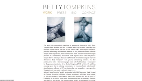
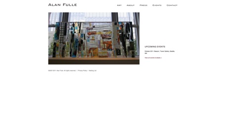
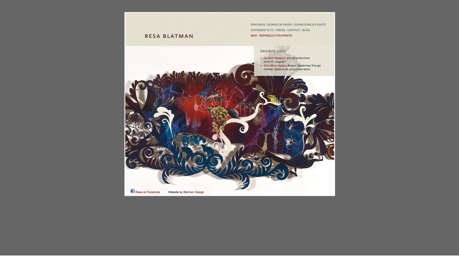
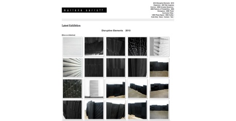
Here are some other well designed sites you can visit. They don’t all have all four things going for them the way Lynn’s does, but each one is very good and has some nice things going for it.
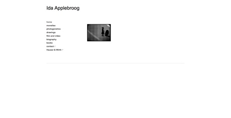
I like the extreme simplicity.
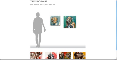
Tracy has a couple of brilliant ideas. On her home page she has her artwork scroll through in relation to a human body so a visitor can get a sense of scale. She has her artwork scroll on her home page like Lynn does
And her categories are smart, installation views are very important.
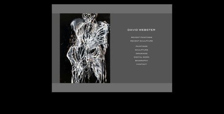
Finally, a break from all this incessant white!
I typically steer clear of splash pages, but for Robert, it works.
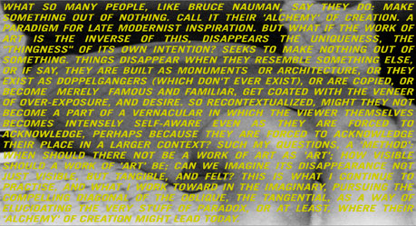
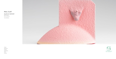
This is not an artist’s page and would be much too complicated as such, however, I think that the type treatment is very sensitive.
Very smart information hierarchy.
Here's another one: Laura Elkins
http://www.lauraelkinsartist.com/
If you have other suggestions, I’d love to see your links.
 MENU
MENU
 Lynn Schirmer's website
